
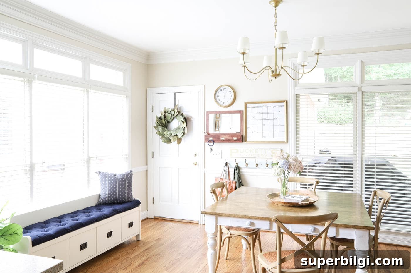
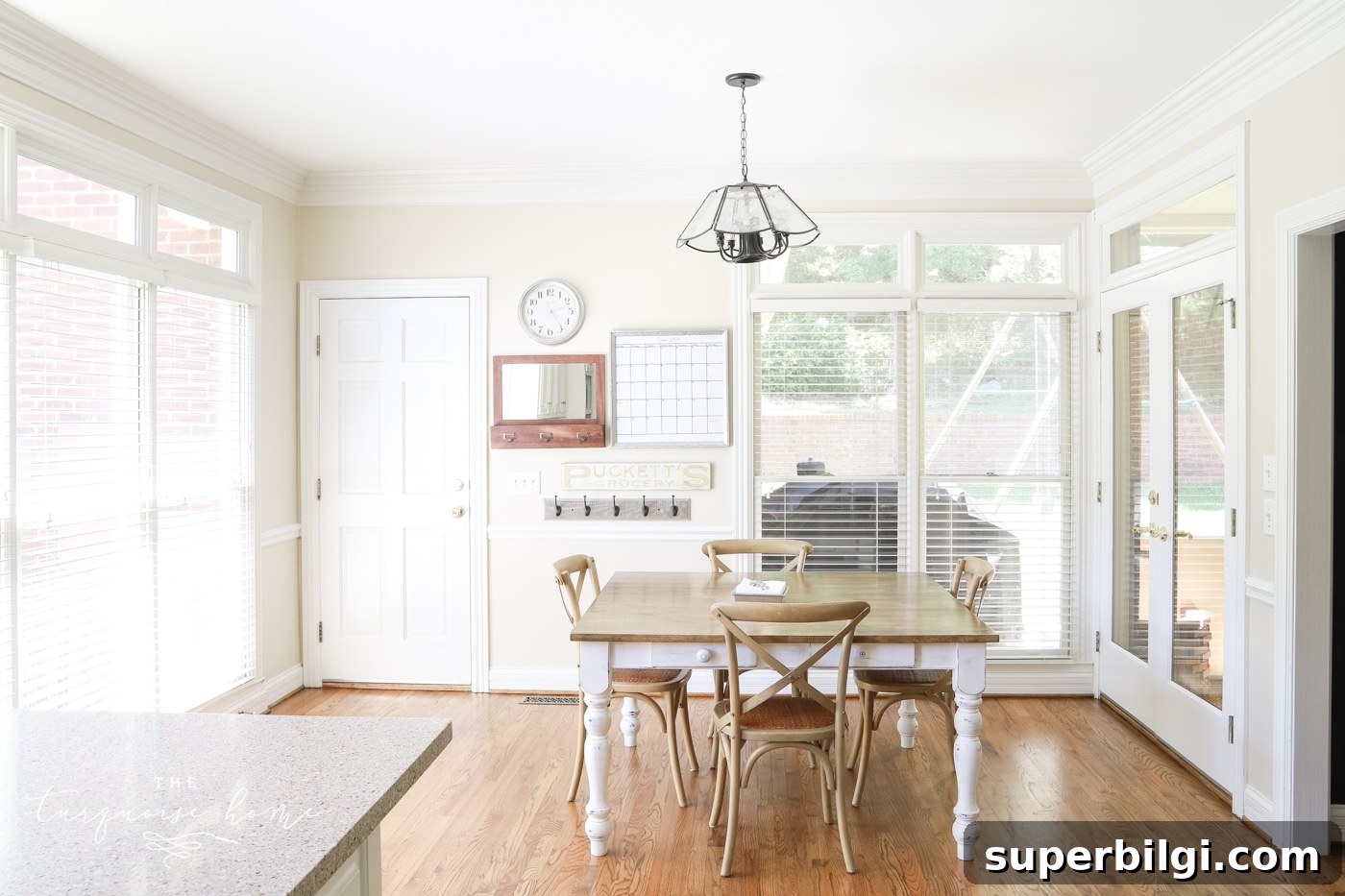
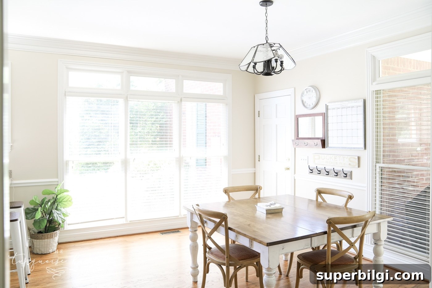
Our eat-in kitchen makeover is finished! We gave our kitchen nook a little refresh this week, and I wanted to show the small space before revealing the final result. I’m so happy with how it came together.
You might remember the kitchen makeover vision board I shared nearly a year ago — it feels like it’s been a long road. Small updates stretched out because of shipping delays and my own decision fatigue, but the end result was worth the wait.
This post contains affiliate links for your convenience. See my full disclosure policy.
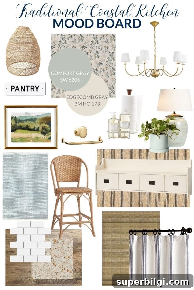
Since this corner of the kitchen is finally done, I wanted to walk through what changed and why. This eat-in area gets so much natural light and is a busy, transitional space — it’s where we eat, craft, and pass through to the garage and screened porch. Because the garage door is our primary entry point, this nook had to balance beauty and real everyday function for coats, backpacks, and daily essentials.
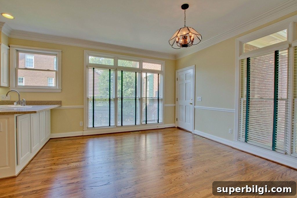
With so many windows and doors, space for adding functional storage was limited. The closest coat closet is by the front door, so it wasn’t realistic to expect everyone to walk across the house to drop off bags and shoes. I needed a compact solution that would serve daily habits without cluttering the sunny feel of the room.
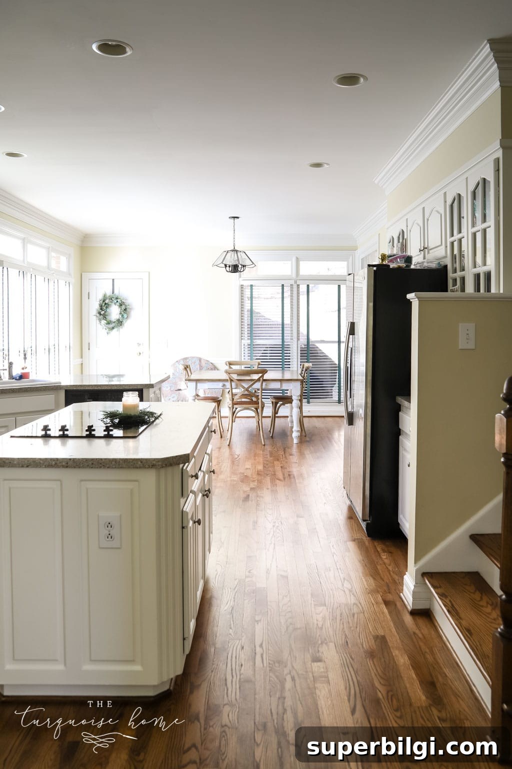
Starting the Makeover
I began by painting the main-floor common areas, including the kitchen, hallway, and entryway, in Edgecomb Gray. That fresh, neutral base carried through the spaces and helped unify the kitchen with the rest of the main level. I also removed the blinds in the living room and added curtains there — the living room windows matched the size of the kitchen windows, so I swapped the kitchen blinds out and removed the rest.
Next, I replaced the light above the table. The original fixture was beaten up and even unsafe once a glass pane started to slide out — so that had to go. We installed a budget-friendly traditional brass chandelier last summer, and it completely changed the vibe. It’s simple but classic, and I still smile every time I see it.
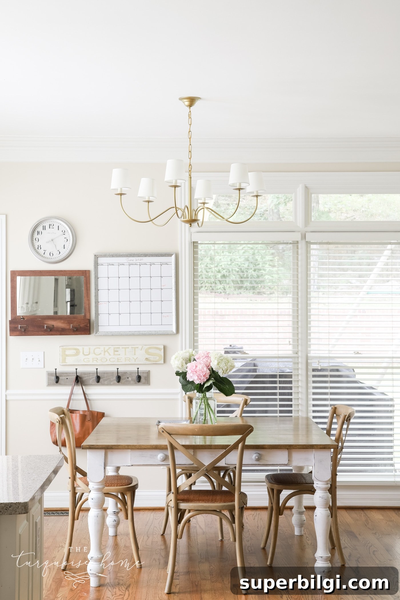
We kept the table and chairs from our previous house since they fit the space well and didn’t need replacing. Those three changes — paint, window treatments, and lighting — made a big visual difference and set the stage for the functional updates that followed.
Our Drop Zone Glow Up
Creating a useful drop zone for backpacks, coats, and everyday pocket items was the next priority. The narrow wall we had to work with already had a clock, a mirror with cubbies (an old Target find), and a personalized “Puckett’s” sign. I added a wall calendar and a row of hooks, and we used the area as our family command center for over a year to see how it held up.
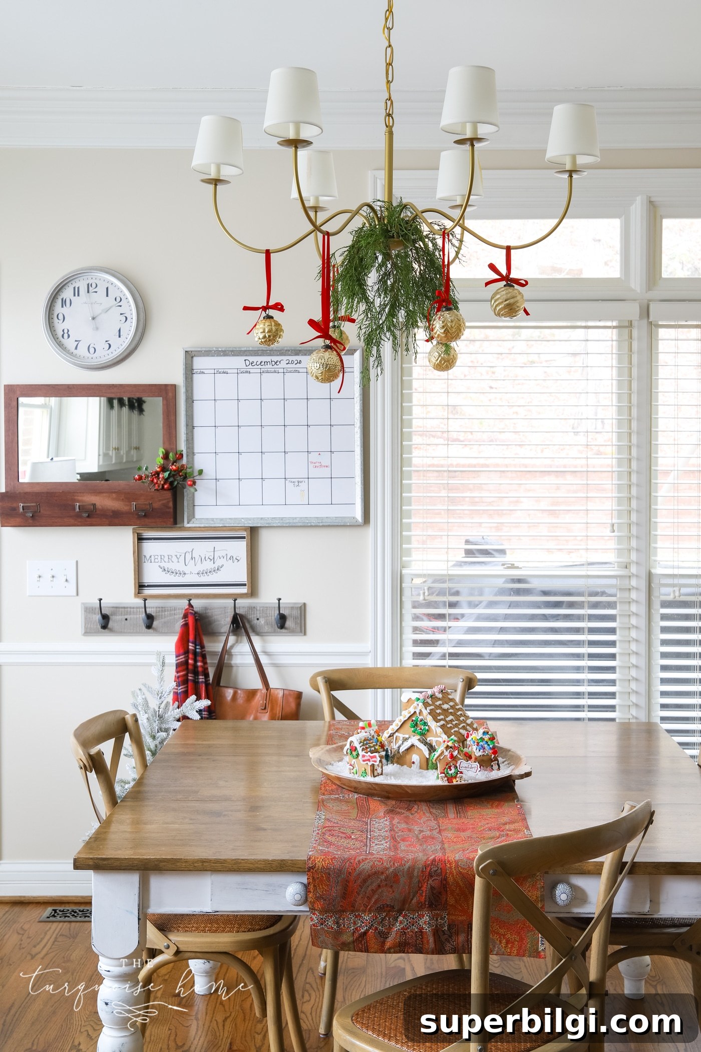
After living with the setup, it proved functional: the hooks are perfect for the girls’ backpacks and coats during the school year, and they hold hats and bags in summer. The clock and calendar keep us on schedule, and the mirror and cubbies are handy for quick checks and emptying pockets. Functionally, the drop zone worked — visually it felt like a collection of mismatched pieces.
You May Also Like:
- 10 Best Mudroom Ideas
- 15 Small Entry Way Storage Ideas
- Top 10 Family Command Centers to Get Organized
To bring everything together, I used Rub ‘n Buff — a metal-colored wax finish — to unify the hardware and accents. I experimented with three shades (Antique Gold, Grecian Gold, and European Gold) and chose European Gold for the best balance with the room’s palette. I also painted the hook board in Comfort Gray to match the pantry door across the room. The warm brass tones against the cool blue-green paint felt just right.
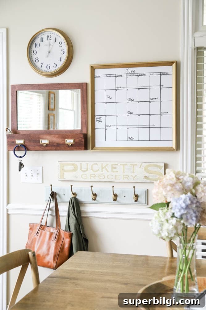
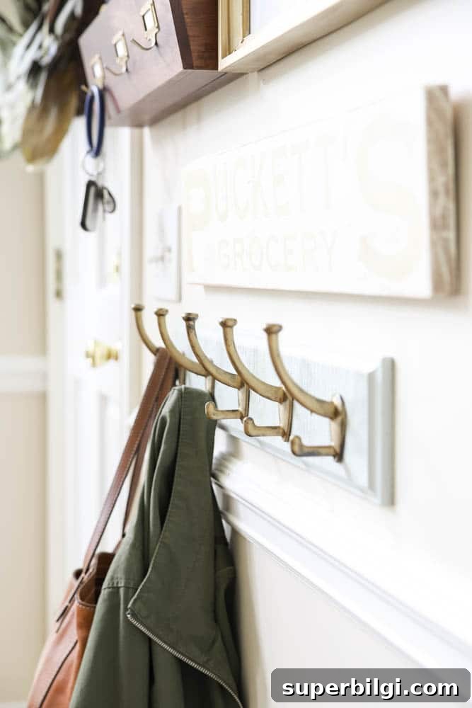
With the metallics coordinated and the board painted, the wall finally felt intentional instead of scattered. The result is both functional and attractive — exactly what a drop zone should be.
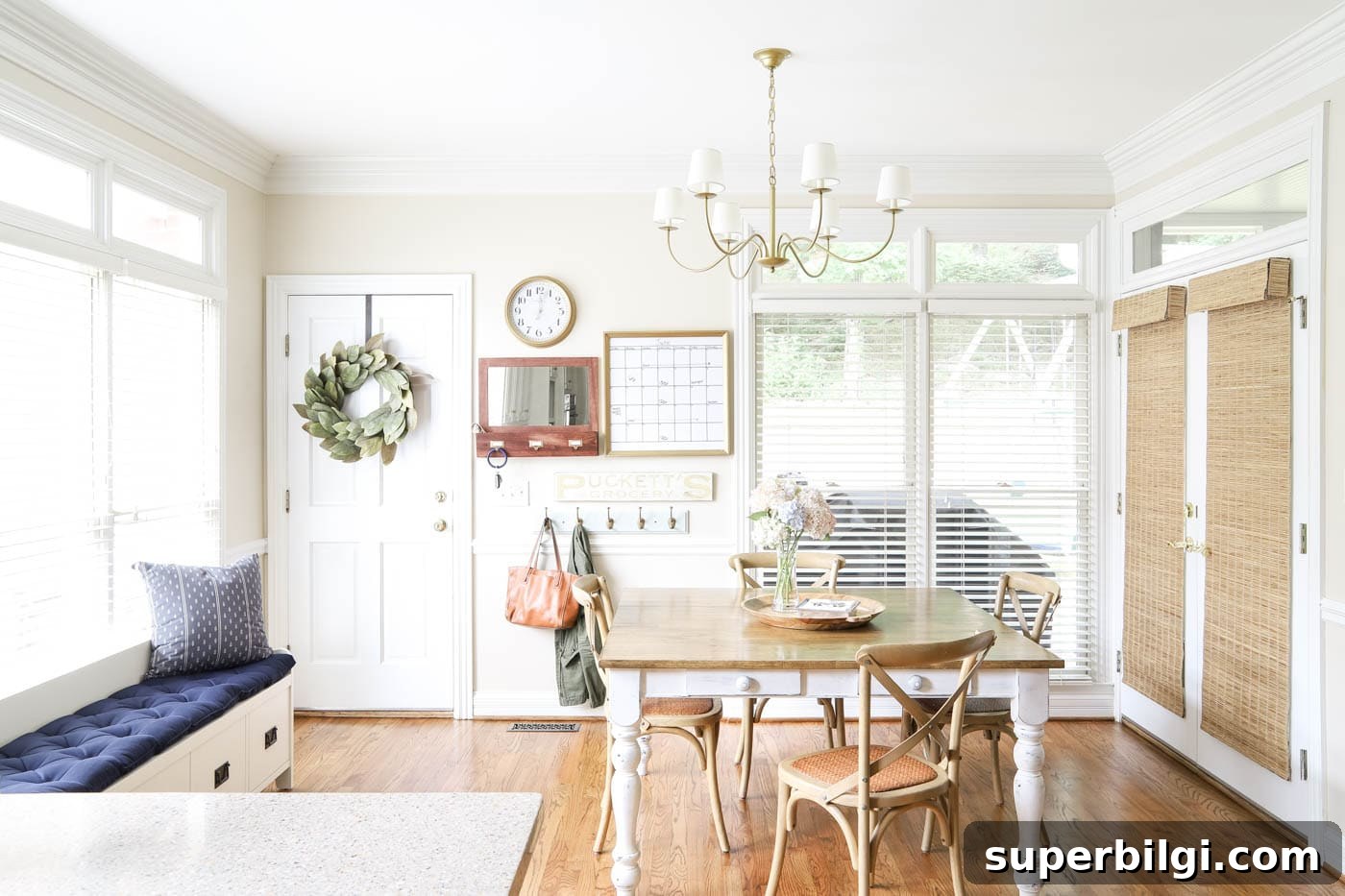
Bamboo Blinds on the French Doors
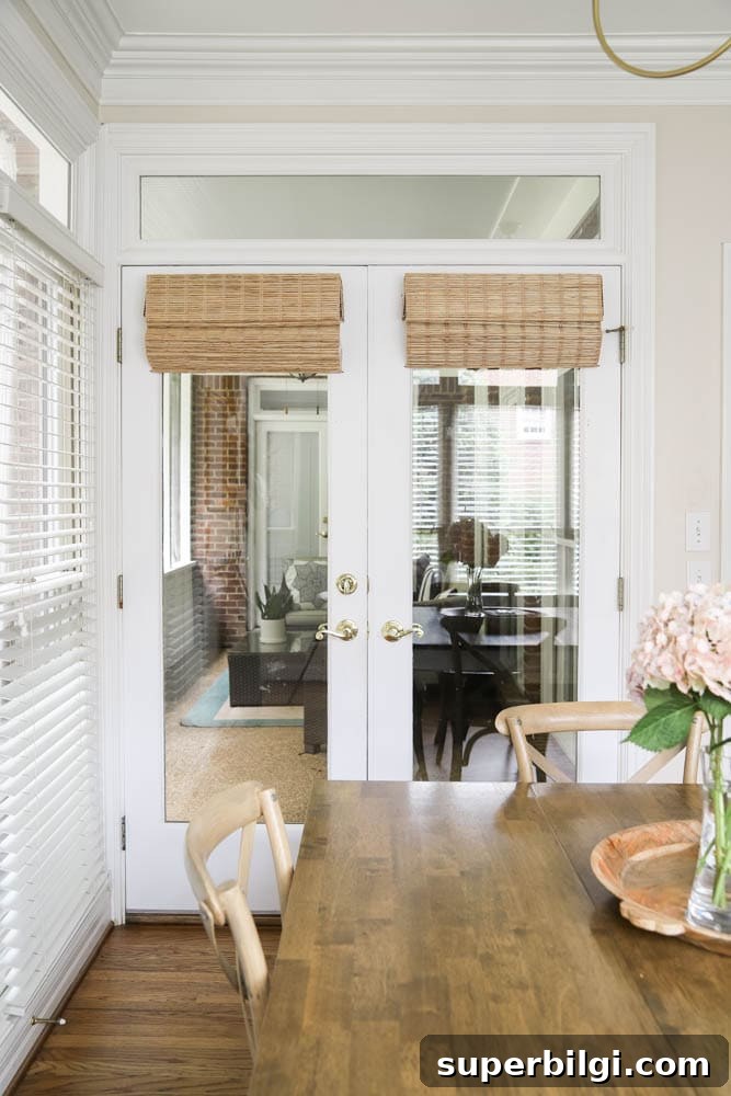
I love adding texture with bamboo shades, so each French door in our house received a matching set. The doors that lead from the kitchen to the screened porch needed covering, and the woven bamboo shades add warmth and visual interest while preserving that cozy, natural feel.
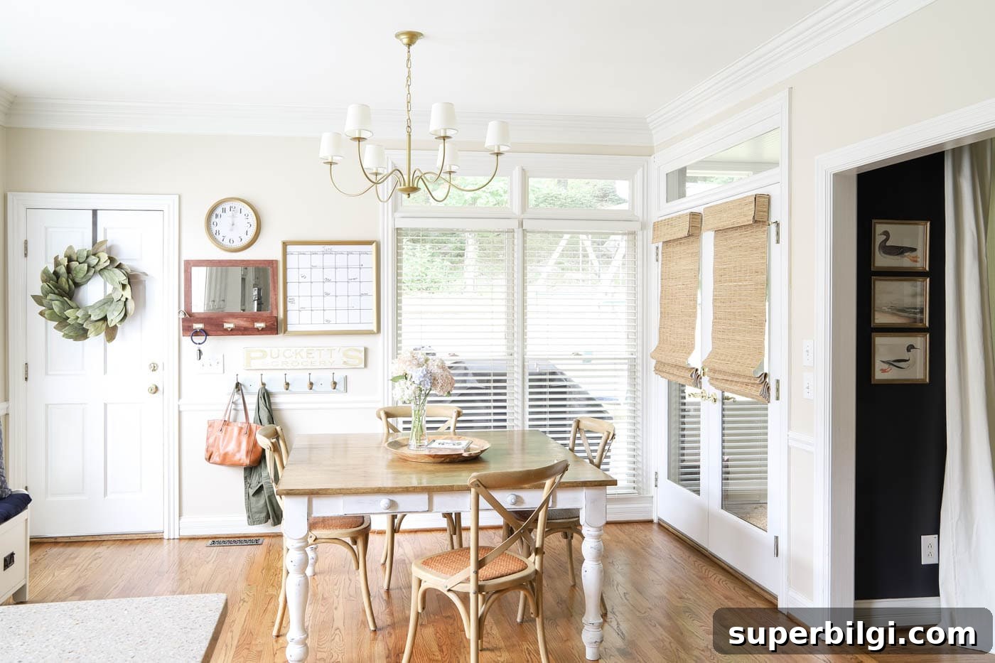
The color I chose is a warm jute tone that complements the navy in the adjacent living room and ties the whole area together. I add privacy liners to my woven shades for a solid look, but you can opt out of a liner if you prefer a more filtered light effect.
The Storage Bench
The final piece was adding a storage bench beneath the long wall of windows. We needed seating for putting on shoes and storage for the family’s extras, and I wanted something clean and classic — no open cubbies or baskets that looked messy. I chose a four-drawer bench with a durable Sunbrella cushion in navy so it coordinates with nearby decor and offers comfortable seating.
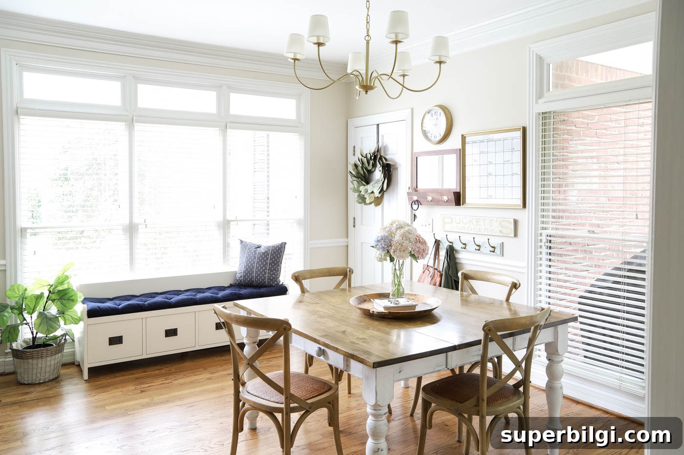
This bench is solid and sturdy, with space underneath to keep the HVAC vent clear. The blue Sunbrella fabric ties into the living room palette, and I appreciate that the cushion can be changed later if I want a different look. I’m still deciding whether to change the drawer hardware to match the brass finishes in the room, but for now the black handles work with our appliances.
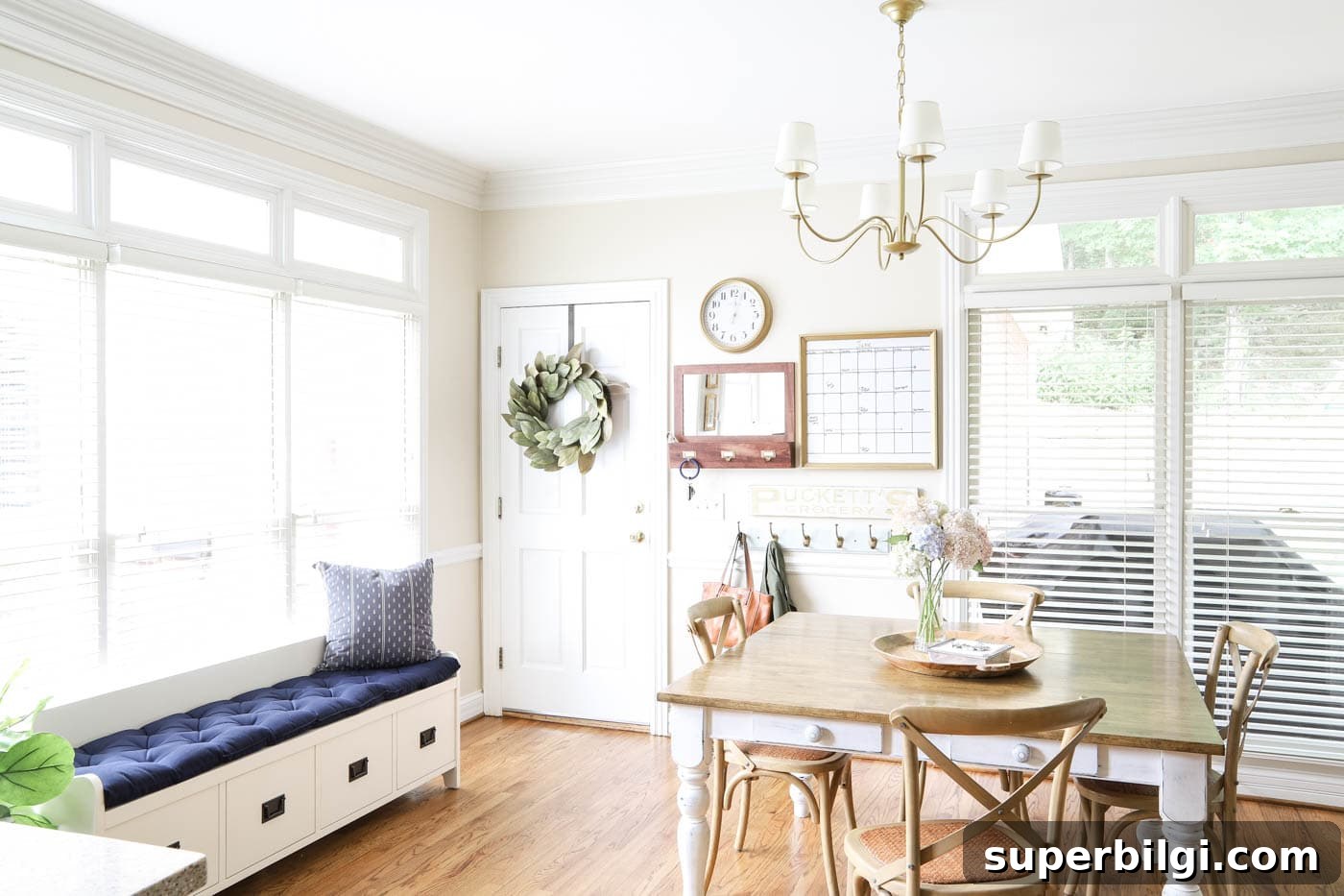
I’m thrilled to have this section of the kitchen checked off my makeover list. Often it’s the small, thoughtful details — coordinated finishes, a functional drop zone, a storage bench, and the right light — that make a room feel complete. We’re still waiting on bar stools and a couple of finishing touches, but the eat-in area now feels intentional, welcoming, and genuinely used by our family.
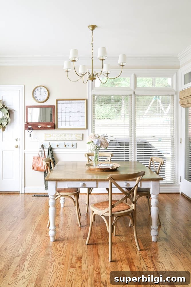
If this inspires anything, it’s that you don’t have to make dramatic changes to transform a space. Thoughtful decisions about paint, lighting, window treatments, and modest storage can create a functional, beautiful area that suits real life.
More Posts You Will Love:
- Colorful Kitchen Island Ideas
- Gorgeous Kitchen Chandeliers You’ll Love
- 17 Beautiful Dining Room Chandeliers