

Repose Gray by Sherwin Williams is one of the most popular gray paint choices for a good reason: it works almost everywhere. Regardless of home style, lighting, or accents, Repose Gray reliably creates a beautiful backdrop.
Sherwin Williams Repose Gray
Repose Gray is a very livable neutral that avoids feeling sterile or stark. It’s a slightly warm gray with faint taupe undertones that make it more approachable than a pure cool gray. Like any paint, it will vary from room to room depending on light and surrounding colors, but its versatility is what makes it a perennial favorite.

In north-facing rooms that have a lot of greenery outside—trees or shrubs—the paint can pick up a subtle greenish cast. Under other lighting conditions you might notice a faint purple undertone, which contributes to the cozy, lived-in feeling that Repose Gray often provides.
Note: If you’re painting the room yourself, having the right tools and a clear plan makes the process much easier. Try real paint samples on your walls to view the color at different times of day and under different lighting. Peel-and-stick paint samples, real sample pots, or brush-out swatches are all helpful ways to see the finish before committing to a full can.
What Colors Go with Repose Gray?
Repose Gray pairs well with a wide range of colors. Sherwin Williams highlights several coordinating shades, which are particularly safe and stylish choices:
- Elder White SW 7014
- Pavestone SW 7642
- Coral Clay SW 9005
Repose Gray vs. Revere Pewter
Repose Gray and Revere Pewter are two of the most commonly recommended greige (gray + beige) colors for interiors. Both are excellent for a unified, neutral palette that works throughout a home. That said, they are not identical:
- Repose Gray leans more toward a neutral gray with subtle undertones that can read as cool or warm depending on the light.
- Revere Pewter tends to read warmer and more taupe, with stronger beige/greige characteristics.
Both make excellent choices for whole-house palettes; the right pick depends on the undertone you prefer and the lighting in your home.
Repose Gray Room Examples
To get a sense of how Repose Gray performs, it helps to see it used in real rooms. Below are common applications where this color shines.
Kitchens with Repose Gray
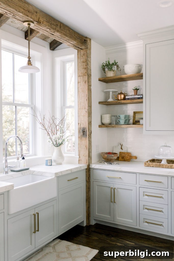
Repose Gray is one of those rare colors that can work on walls, trim, and even cabinets. It pairs beautifully with white cabinets, wood accents, and natural stone counters. In many kitchens the color can make white or off-white cabinetry pop while keeping the room warm and inviting when carried up onto the ceiling or used throughout the space.
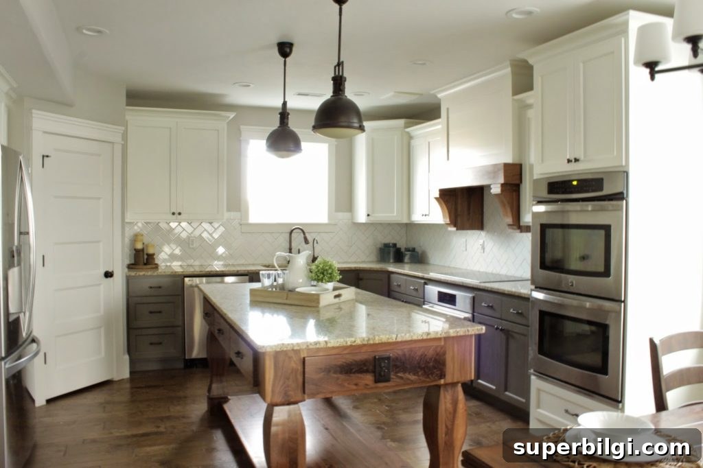
Repose Gray cabinets look particularly elegant with marble counters and wood accents, offering a timeless look for a kitchen remodel.
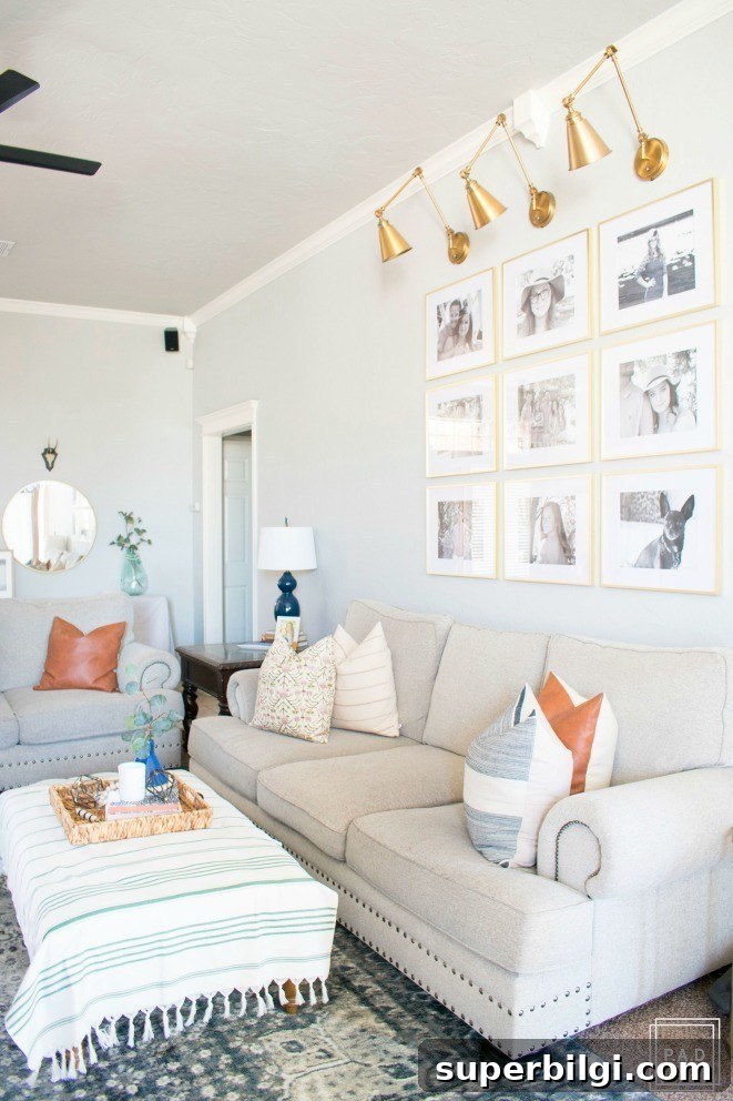
Repose Gray in Living Rooms
For homes with open floor plans, Repose Gray is a strong candidate for a cohesive, whole-house color. It’s light and airy enough to avoid a heavy feel, yet it still provides enough depth to offer visual interest. In many living rooms it reads soft gray with just a whisper of a warm undertone—sometimes showing a slight green cast in specific light—which can work surprisingly well with brass or gold accents for an elevated look.
Repose Gray in Bedrooms
Bedrooms benefit from Repose Gray’s calming nature. It creates a neutral, restful backdrop that allows bedding, textiles, and accessories to stand out without overwhelming the space. Because the color is so adaptable, you have freedom to choose accent colors—soft pastels, deep jewel tones, or warm neutrals—all will read nicely against Repose Gray.
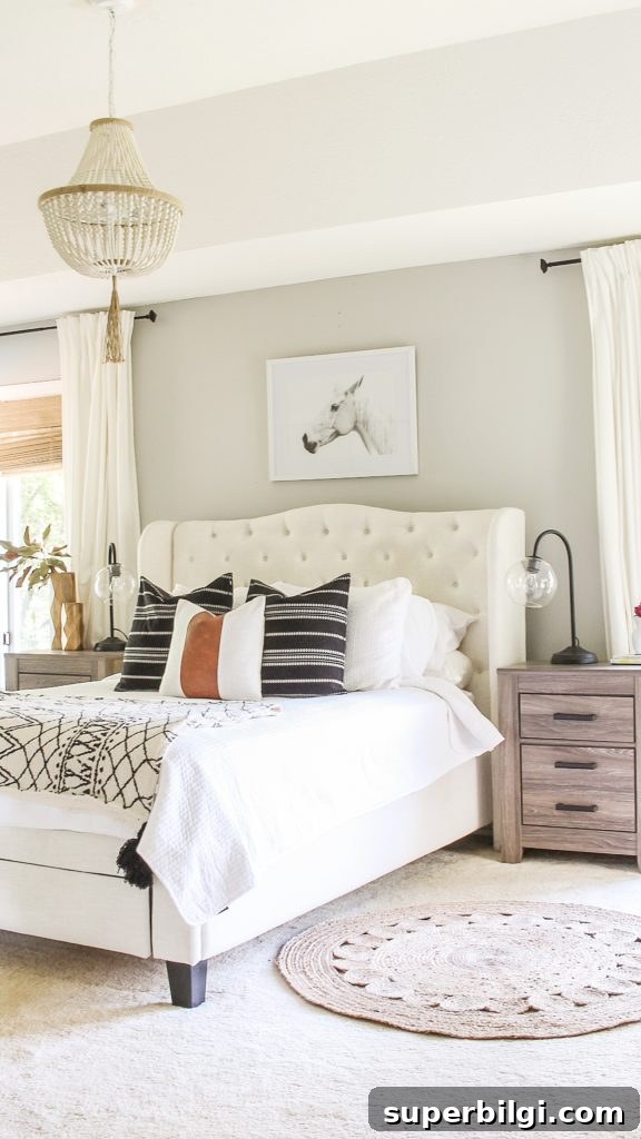
Overall, Repose Gray is a versatile choice that can create a serene, sophisticated look in almost any room. Before you paint an entire room, always test a few swatches in the actual space so you can observe how the color changes over the course of a day.
More Popular Home Paint Colors
- Agreeable Gray
- Sea Salt
- Hale Navy
- Revere Pewter
- Gray Owl
- Wythe Blue
- White Dove
Tips for Painting a Room Yourself
Painting your own room is very achievable with the right tools and a little planning. Below are practical items and tips to make the job easier and cleaner:
- Quality paintbrush: Invest in a good brush—cleans up well and lasts for many projects if cared for properly.
- Painter’s tape: Essential for crisp, clean edges if you don’t have a steady hand.
- Drop cloths: Protect floors and furniture from spills and splatter.
- Paint cup or grip: A dedicated paint cup with a brush rest helps reduce hand fatigue and keeps things tidy.
- Roller and tray: Use a reliable tray and liners for easier cleanup; a good roller yields smoother coverage and saves time.
More posts you might enjoy:
- The Best Green Paint Colors for Your Home
- The Best Blue-Green Paint Colors
- Best Living Room Paint Colors
- How to Paint a Concrete Patio
- Paint a Room Like a Pro in 5 Easy Steps