
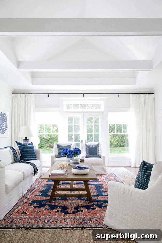
If you’ve ever tried to choose a white paint color, you already know: not all whites are the same. If you haven’t, you might assume “white is white,” but whites come in countless shades and undertones, and selecting the right one can make or break a room.

I remember the first time I picked up what looked like a simple white can at the hardware store. I wanted a white that matched my trim for a board-and-batten project. The trim looked like plain white in my home, and I’d often heard designers say that “off-the-shelf” whites work well. I soon learned the hard way that a can labeled white can be anything from brilliant, cool white to a warm, creamy shade. The first stroke I painted was shockingly bright and didn’t match my trim at all.
Pro tip: Always test the real paint color at home before committing. The best way to do this is with real paint samples—peel-and-stick or small sample pots—so you can view the color in your actual light and next to your other finishes.
If you’re painting the room yourself, having the right tools helps a ton. Good brushes, painter’s tape, drop cloths, and a quality roller tray still make a big difference in the result.
Tips for Choosing the Best White Paint Color
1. Research room photos and examples online
Start by searching for rooms painted in the whites you’re considering. Pinterest and Google are great for seeing how a color behaves in real spaces. These photos give you an initial direction, but remember they’re not exact—lighting, editing, and camera settings all alter a paint’s appearance.
2. Study white swatches to identify undertones
White swatches often look less “white” online because they reveal subtle undertones—gray, blue, yellow, green, or pink—that don’t show up on a wall until applied and viewed in different light. Reviewing swatches helps you spot those undertones before you test the color in your space.
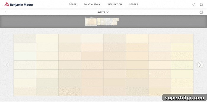
3. Always get samples and test on the wall
Testing is essential with whites. Paint large swatches on the wall—or paint several poster boards with the sample and tape them to different walls—and observe the color at various times of day. How a white reads at noon can differ from how it looks in the evening under lamps.
If you need help deciding whether to use a cool or warm white, consider your existing finishes, flooring, and furnishings. Slightly warm whites (without being yellow) often feel inviting and coordinate well with most palettes.
Top 10 Favorite White Paint Colors
To save you time at the paint store, here are reliable white paint colors I recommend and use. These options cover bright true whites, subtle cool whites, and soft warm whites that work well on walls, trim, and cabinetry.
1. Decorator’s White (Benjamin Moore)
Decorator’s White is a popular choice with a faint cool-gray undertone. It reads as a clean, true white in most lighting and is widely used by builders and designers for its versatile, modern look.
2. Shoji White (Sherwin-Williams)
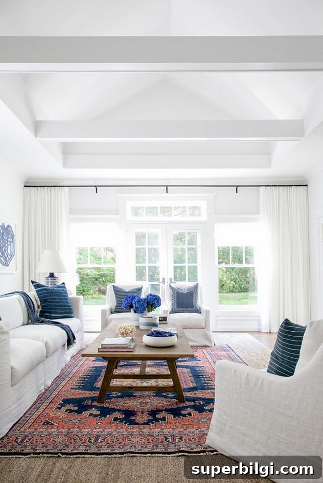
Shoji White is a soft gray-white that can appear almost pale gray or even slightly green in some lights. It’s subtle and elegant—test it on your walls before committing because it can shift depending on surrounding colors.
3. Extra White (Sherwin-Williams)
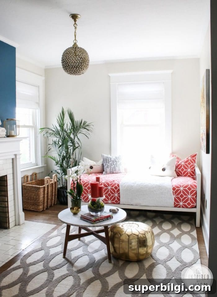
If you want a crisp, bright white that makes other colors pop, Extra White is an excellent pick. It’s a true bright white that reads clean and modern.
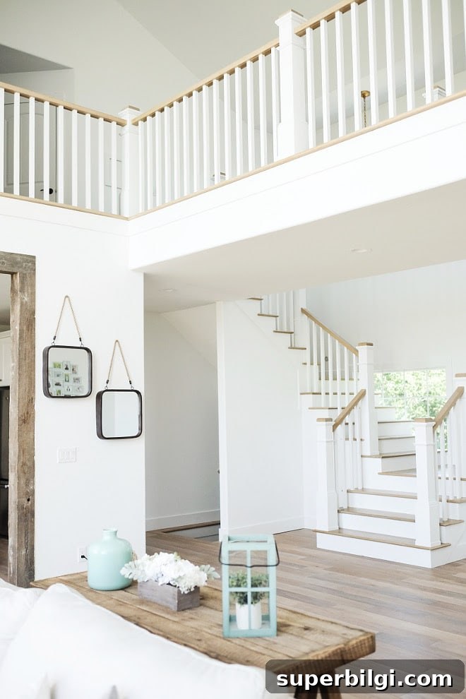
4. White Dove (Benjamin Moore)
White Dove is a cool white with a barely-there undertone, often appearing slightly grayed rather than yellow. It’s among Benjamin Moore’s most popular whites and is a classic choice for many designers.
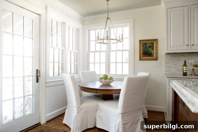
5. Simply White (Benjamin Moore)
Simply White is my personal favorite and my go-to white. It’s a subtle warm white that glows without reading yellow. It was Benjamin Moore’s 2016 Color of the Year and works beautifully on cabinets, trim, and walls.
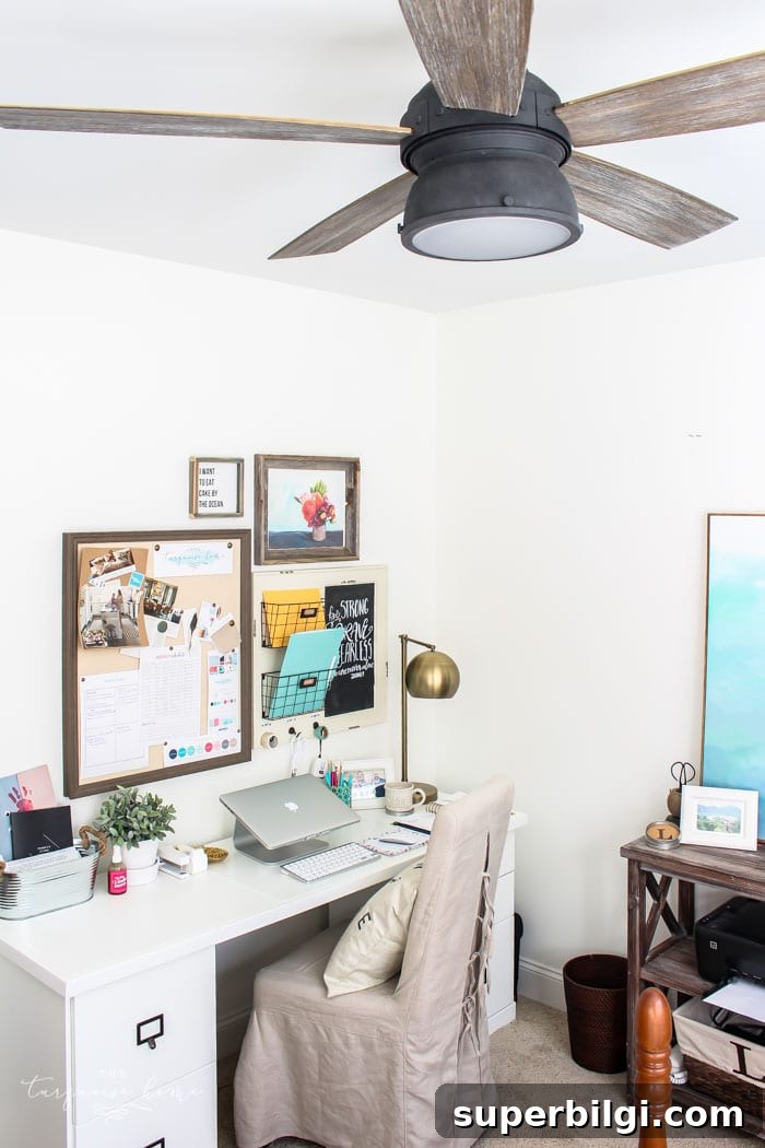
6. Paper White (Benjamin Moore)
Paper White reads as a pale gray-white and pairs especially well with cool blues, grays, and violets. It’s lovely on walls paired with a crisp white trim.
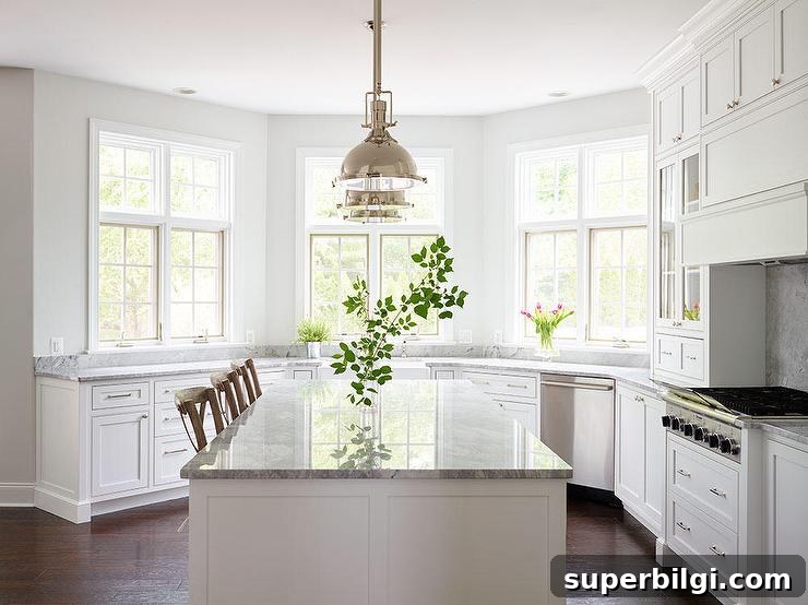
7. Dover White (Sherwin-Williams)
Dover White is a slightly warm white that’s flattering on cabinets and cozy interiors. It has enough warmth to feel inviting without appearing yellow.
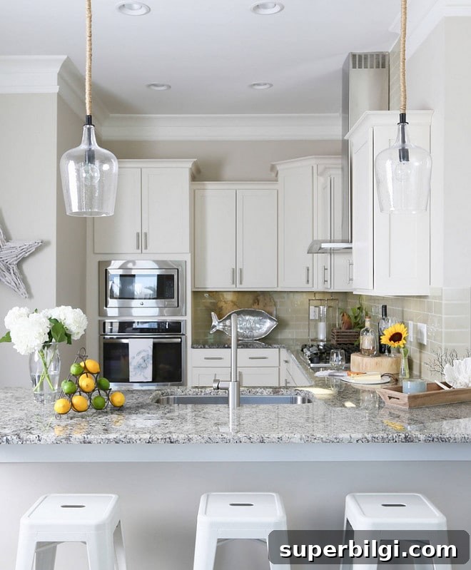
8. Alabaster (Sherwin-Williams)
Alabaster is a soft off-white with a gentle warm yellow undertone. It was Sherwin-Williams’ 2016 color of the year and often reads warm and comforting on walls.
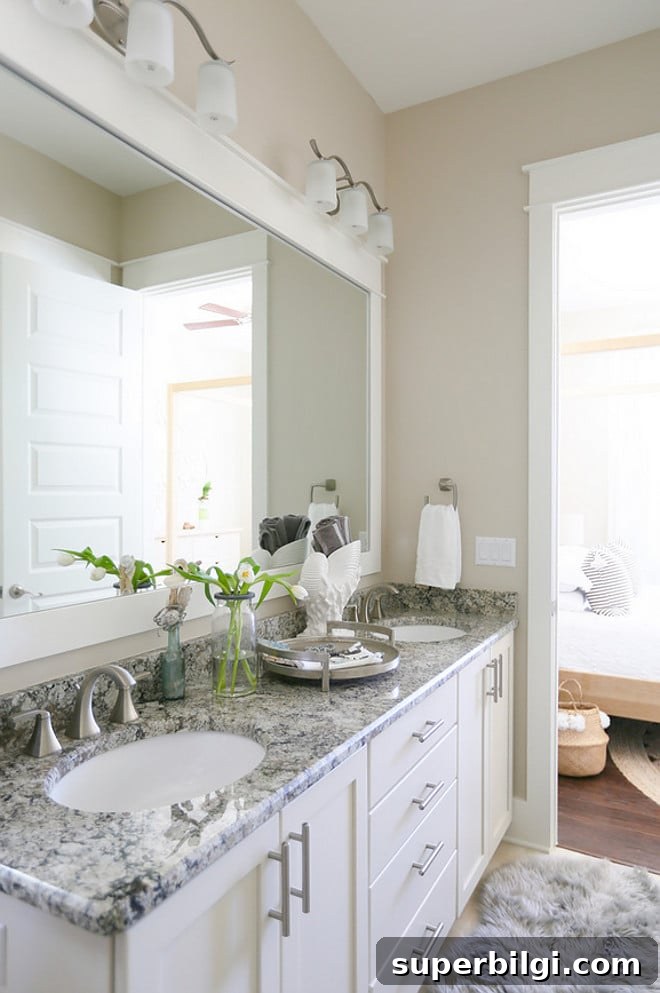
9. Antique White (Sherwin-Williams)
Antique White leans warm and creamy—perfect for furniture or spaces aiming for a farmhouse or aged aesthetic. It’s a soft off-white that adds depth without looking stark.
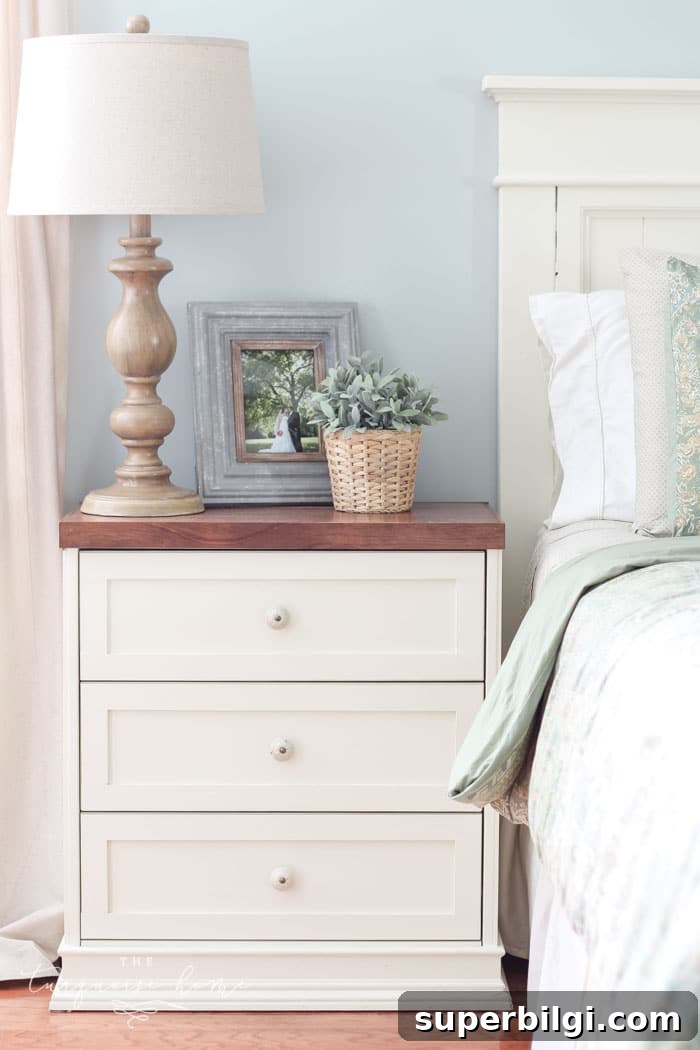
10. Snowbound (Sherwin-Williams)
Snowbound is a soft, slightly warm white with subtle gray undertones. It reads as a gentle white without glaring in bright natural light, making it a favorite for walls, ceilings, and trim.
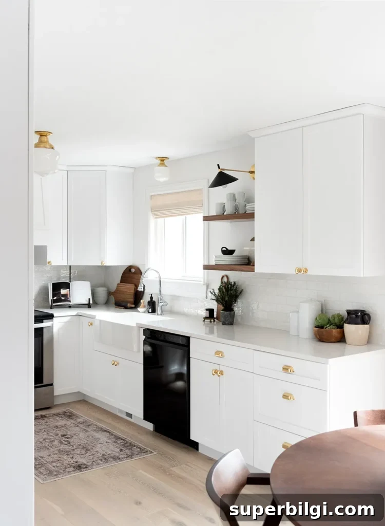
Hopefully this roundup gives you a clearer starting point for selecting the perfect white for your home. Testing samples in your own rooms will ensure the final choice fits your light, furnishings, and style.
Bonus tip: If you want your walls and trim to read as the same color but with different finishes, use the same paint color in different sheens—eggshell on walls and semi-gloss on trim. Because they are the same color, they flow together seamlessly even though the sheens differ.
Useful white and neutral paint names to consider
- Agreeable Gray
- Repose Gray
- Sea Salt
- Hale Navy
- Revere Pewter
- Gray Owl
- Wythe Blue
- White Dove
Basic tools for painting a room yourself
These are the essentials I use when I paint my own rooms: a quality paint brush, painter’s tape, drop cloths, a comfortable paint cup that holds a brush, and a reliable roller tray with liners for easy cleanup. Investing in good tools saves time and improves the final finish.
Good luck choosing the best white for your space—you’ll be amazed how the right white can brighten, soften, and complete a room.