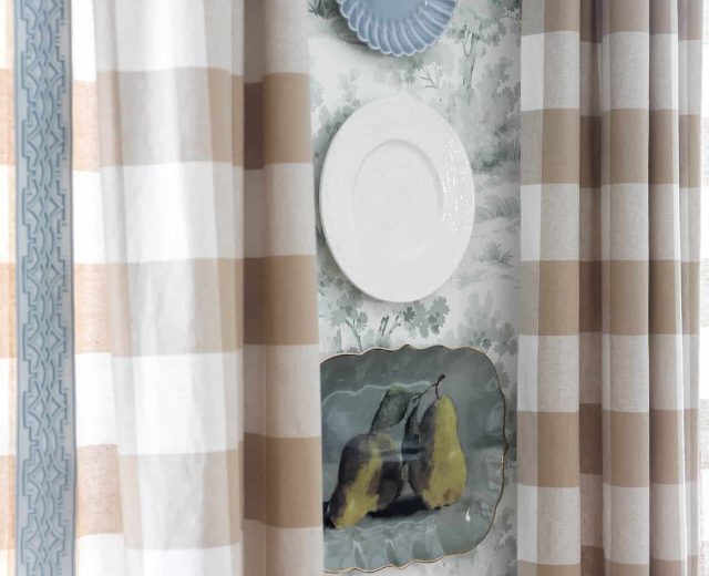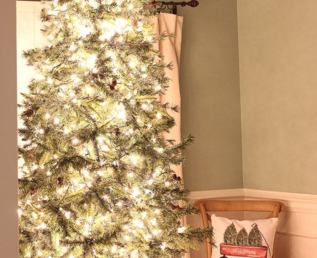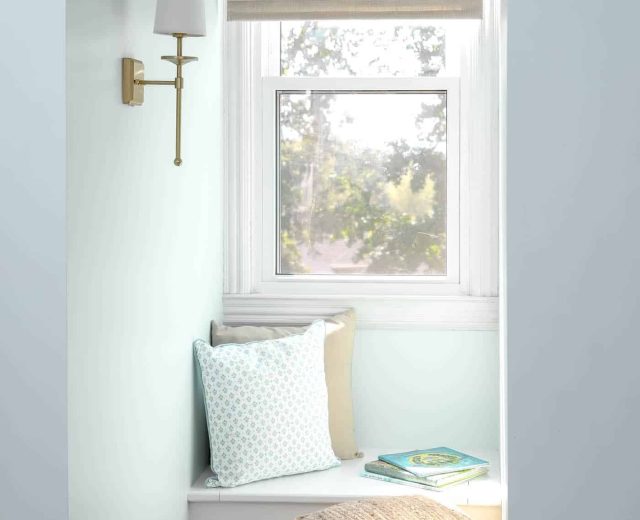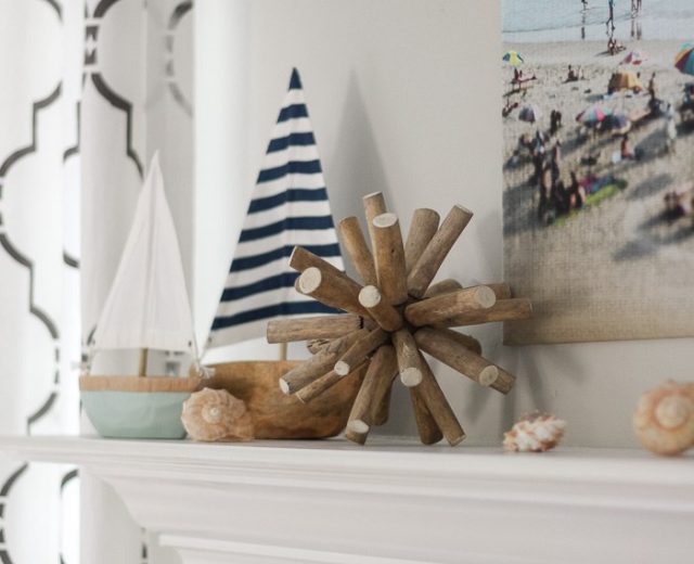

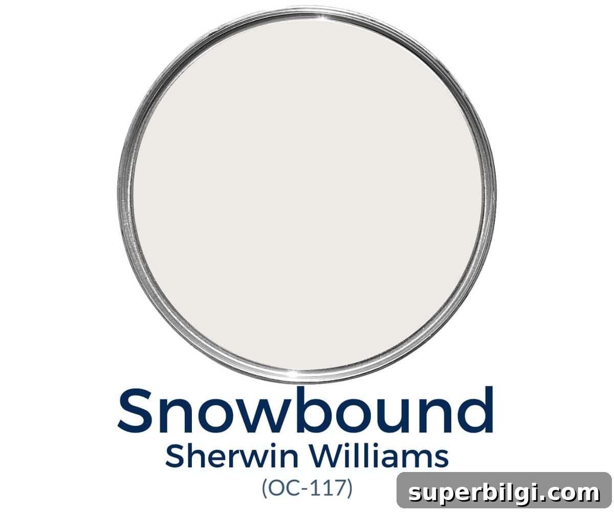
Sherwin Williams Snowbound is a widely loved white paint color. It’s a soft, bright white that lightens a room without feeling overly stark.
Choosing a white paint sounds simple, but subtle differences in undertone and light reflectance can make a big impact. Instead of testing a new white for every project, I recommend keeping a few reliable go-to whites that are versatile across rooms and styles.

One designer favorite I often recommend is Sherwin Williams Snowbound (SW 7004). It reads as a neutral white—clean and bright yet soft and slightly muted—which is why many designers and homeowners choose it for walls, trim, ceilings, and even exteriors.
PRO Tip
Always test real paint samples in your own home before committing. Peel-and-stick samples or small real-paint swatches let you move colors around and see how different light and surrounding decor affect the shade.
What color is Sherwin Williams Snowbound?
Quick highlights about Snowbound:
- Neutral off-white with mild cool-gray undertones
- Light white with an LRV (Light Reflectance Value) of 83
- Popular for walls, ceilings, trim, and exteriors
- A soft white that’s neither overly bright nor strongly creamy
Undertones in Snowbound
Snowbound is a versatile white with very subtle gray undertones that temper its brightness and prevent it from appearing icy. It also carries faint taupe (pink/purple) undertones—so slight you won’t see a pink wall, but enough to soften the white and add warmth.
Keep in mind that surrounding colors and natural light change how Snowbound reads. In cooler, northern light it can look more muted and gray-leaning; in warm, southern light it tends to read as a cleaner white, sometimes showing a whisper of taupe in late west-facing light. You will not usually notice yellow undertones unless the color is placed next to distinctly yellow decor.
LRV of SW Snowbound
Light Reflectance Value (LRV) measures how much light a color reflects. Snowbound has an LRV of 83, which means it reflects a lot of light and reads bright without being overwhelmingly white. In low natural light it may read as an off-white; in ample light it reads as a clean, airy white.
Sherwin Williams Snowbound Coordinating Colors
Snowbound pairs best with cooler, gray-tinged colors rather than warm beiges. Sherwin Williams suggests coordinating with gray-leaning neutrals such as Colonnade Gray and Autumn Orchard.
Personal favorites that pair well with Snowbound include:
- Repose Gray
- Mindful Gray
- Silver Strand
- Aqua-Sphere
- Copen Blue
- Argos
- Naval
- Sea Salt
Best Trim Colors to Go With Snowbound
If you choose Snowbound for walls, you can either use the same color for trim or select a brighter white for contrast. Painting trim the same color as the walls avoids highlighting any undertones and creates a seamless look. To add subtle contrast without changing color, use different finishes—semi-gloss for trim to make it appear brighter and eggshell for walls to make them read slightly darker.
If you prefer contrast, try a bright true white for trim such as High Reflective White or Chantilly Lace for a crisp, modern look. Simply White (a slightly brighter off-white) can also work well depending on your lighting and other finishes.
Snowbound vs. Other White Paints
Pairing multiple whites can be tricky because each has its own undertone. Here’s how Snowbound compares to some popular off-whites:
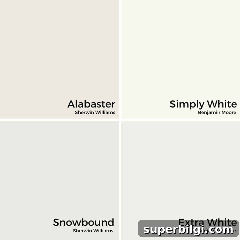
Snowbound vs. Alabaster
Alabaster has warm, beige undertones, while Snowbound is cooler. Alabaster pairs well with creams and true beige tones, whereas Snowbound works best with grays and cool neutrals.
Snowbound vs. Simply White
Simply White leans creamier and can read slightly yellow next to a purer white. Because their undertones differ, they’re not the best pairing if you want a cohesive white palette.
Snowbound vs. Extra White
Extra White has a cool blue-white cast. Next to Snowbound you’ll notice Extra White’s coolness, so they may clash. For a truer white that complements Snowbound, Pure White is a safer choice.
Where can you use Sherwin Williams Snowbound?
Snowbound is timeless and flexible—suitable for many applications including:
- Wall molding
- Trim
- Ceilings
- Interior walls
- Exteriors
Is Snowbound a good color for cabinets?
Snowbound isn’t my first pick for cabinets because its subtle undertones can clash with some countertops and backsplashes. However, it can work beautifully with darker counters that lack peach, pink, or strong greige tones.
Home Styles That Work With Snowbound
Snowbound is adaptable to nearly any design style. Use it confidently in:
- Farmhouse
- Traditional
- Transitional
- Modern and more
Room Examples Using Sherwin Williams Snowbound
Here are examples showing how Snowbound appears in different rooms and lighting conditions. Notice how decor, light direction, and finishes alter its appearance.
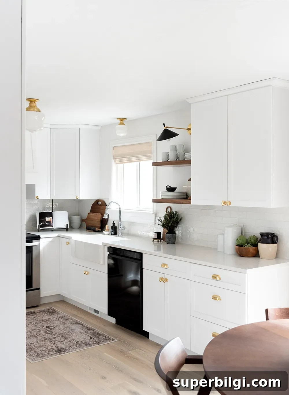
Kitchen Painted With Snowbound
In kitchens, Snowbound acts as a unifying white that softens multiple white finishes into a cohesive whole. It’s bright enough to keep the space fresh yet soft enough to avoid a sterile feel.
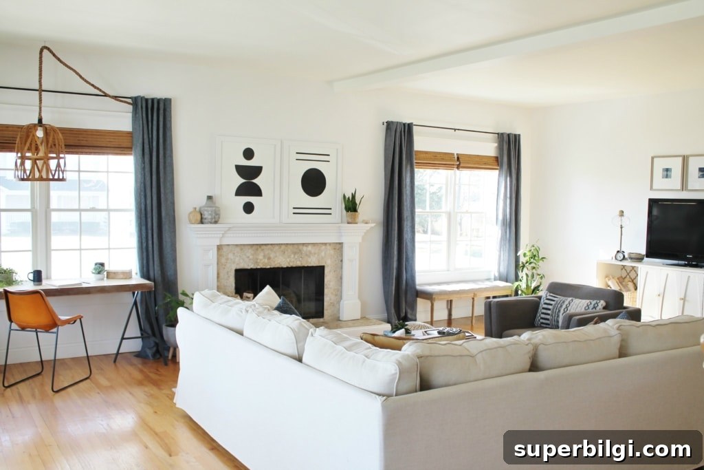
Living Room
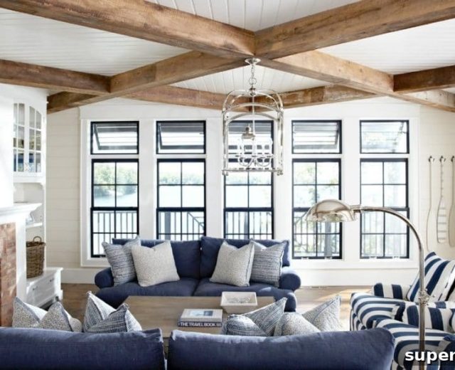
Snowbound offers a gentle, off-white quality that reads light without glare in living rooms. Its soft neutrality pairs well with varied textiles and artwork.
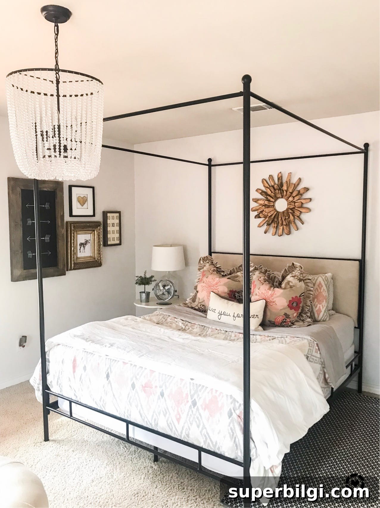
Bedroom
Snowbound is calming and bright—ideal for bedrooms where you want a restful atmosphere without making the room feel closed-in or dim.
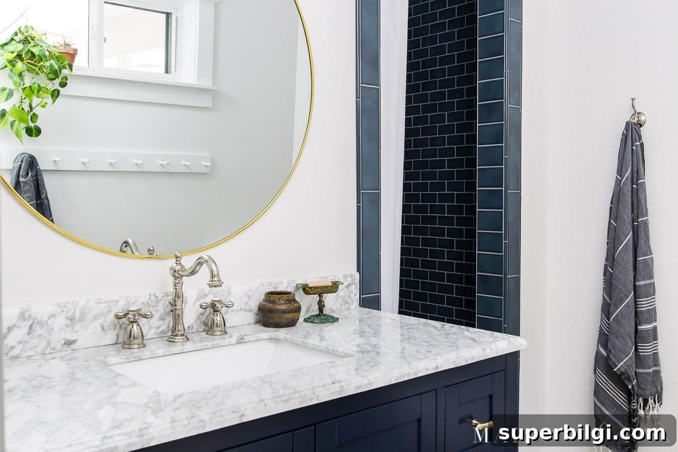
Bathroom
Snowbound brightens bathrooms even with limited natural light. It pairs exceptionally well with navy or other deep accent colors, delivering clean contrast without harshness.
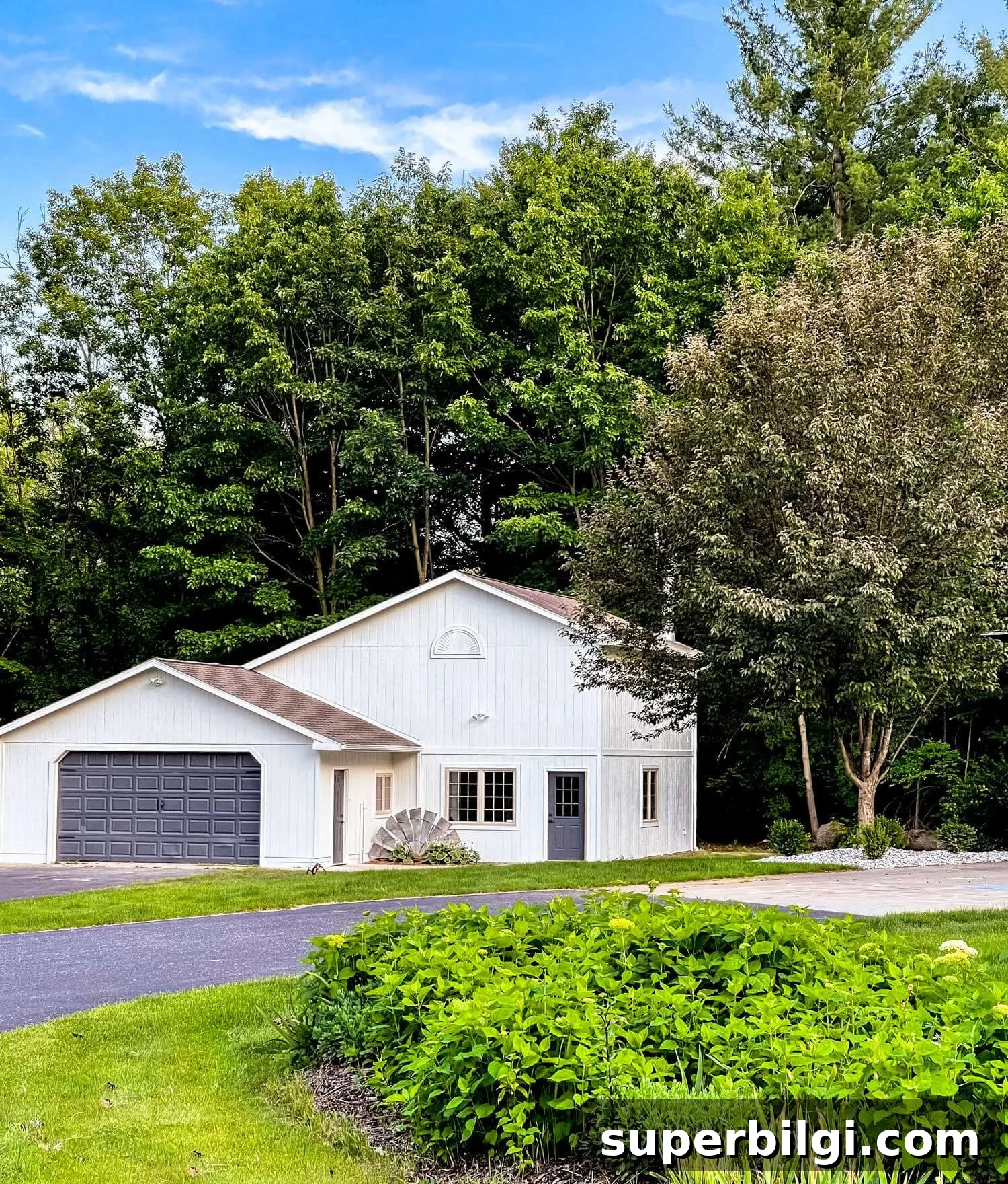
Exterior
For exteriors, Snowbound is a strong choice because it reads as bright white without becoming glaring in strong sunlight. Its soft undertones help it appear refined rather than stark.
Frequently Asked Questions
Is Sherwin Williams Snowbound warm or cool?
Snowbound leans slightly warm due to very subtle taupe undertones, but it also has mild gray undertones that keep it soft and muted.
Does Snowbound look yellow?
No. While Snowbound has a hint of warmth, it does not carry the yellow undertones typical of creamier whites.
How do I choose a white paint color?
Choosing white is a challenge because undertones shift with light and surrounding finishes. Test real paint samples in the actual room and view them at different times of day to find the best match.
Sherwin Williams Snowbound is a beautiful neutral white for anyone seeking a clean yet soft white that works well in many spaces without feeling stark. If you want a bright, understated white that adapts to light and decor, Snowbound is worth sampling in your home.
More Paint Colors
If you’re building a palette, consider other reliable favorites such as Hale Navy, Repose Gray, Agreeable Gray, Sea Salt, and Revere Pewter.
Tools to Help Paint a Room Yourself
For DIY painting, invest in quality brushes, painter’s tape, drop cloths, a comfortable paint cup, and a reliable roller tray to get clean, professional-looking results.